Understanding COVID-19 Statistics
People always seem to trust numbers. The words of politicians, news outlets, and even medical practitioners often have a recognised level of subjectivity to them, but numbers are objective. They can’t lie. This level of trust belies how easy it is for statistics to be misunderstood or even manipulated. In this post, we will discuss what makes the numbers imperfect, how to better understand them, and how far we should trust the conclusions drawn from them.
The Numbers Are Not Perfect
You and I and everyone else knows that the numbers collected do not accurately reflect the size and extent of the pandemic. There are four main reasons why.
1. We will not (and we cannot) test everyone. Predictions vary wildly about the real infection rate. The fact is that there is not a single country on the planet right now that has tested every single one of their citizens. At the moment, it appears frankly impossible that we will ever have the capacity to test the entire population. As a result, statistics on the total number of infected will always be an estimate at best.
2. Testing is not 100% accurate. A test for a virus rarely will be, as there is too much room for human and natural error. Consider the number of stories we have heard about tests being withdrawn for low accuracy or not working entirely. However, the other problem we face is that we don’t know how inaccurate our current tests are, and this varies from country to country.
3. Sources are not perfect. It is surprisingly difficult to find reliable statistics for every single country in the world, given the differences in time and type of reporting, the potential political motivations of individual governments, and the diversity in level of testing. The Financial Times considered that the death toll from coronavirus may be almost 60 per cent higher than reported in official counts.
4. Reporting is influenced by external factors. It is common to see a spike in the death toll on Tuesdays. This is not unique to COVID-19. This is because oftentimes deaths cannot be reported until the family of the deceased are made aware and have given their consent. It is theorised that hospitals find it more difficult to contact family members over the weekend, which means that many deaths from Friday to Sunday will be told to the family on Monday, and the deaths will be reported on Tuesday. For this reason, statisticians must be careful when calculating the rate of infections and deaths from this raw data.
How Do I Graph a Pandemic?
Let’s start with a few basics. Given our limitations, how can we use the numbers we have to accurately inform ourselves and others of the pandemic?
1. I prefer using death toll, as opposed to confirmed infections, as a more reliable indicator of infection rates in different countries. As testing is significantly more variable than reported deaths as a source of information, the death toll is used as a more accurate reflection of a country’s overall infection rate. However, it should be noted that this too has its limitations - most notably, in the significant variation between the countries’ capacity to treat infected patients and how it removes any indication of rate of recovery. This is in no way perfect data, but in my opinion is far more reliable than using a country’s data from the number of confirmed infected.
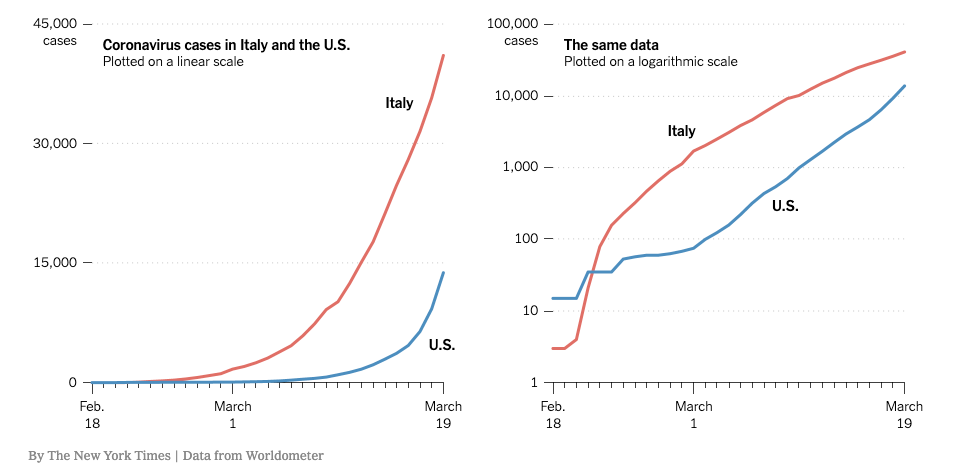
2. Graph using a logarithmic scale (i.e. 1, 10, 100, 1000), as it is a far more useful indicator of the rate of infection. This is because COVID-19 spreads at an exponential rate, which requires the audience to intuit whether they think the curve is significantly curvier than before or not. Switching to a logarithmic scale gives an easy visual indicator for when the rate has become steady or is even decreasing. Graphs that use a standard linear scale (i.e. 1, 2, 3, 4) are useful to emphasise the severity of the pandemic, but do not help us understand our own progress in dealing with it.
3. Make no adjustment for population. Dividing the number of deaths or infected by the population is only somewhat useful if you want to find out, broadly, what your chance is of being infected, but even then this is not a useful exercise, as one must also take into account the population density of your specific area and the types of preventive arrangements your governing body has made. For this reason, I would advise you not to use them. The virus does not care how many people live in your area, and graphs which adjust for this can be grossly misleading.
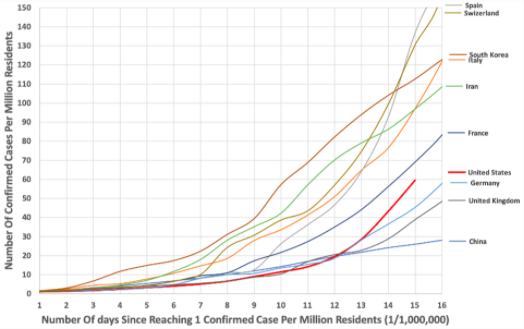
Population Adjusted Graph, using data from the Johns Hopkins Coronavirus Resource Center’s GitHub database.
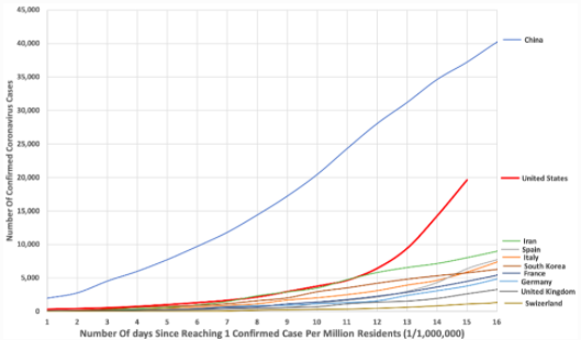
Gross data graph (i.e. no adjustment for population) using the same raw data as above.
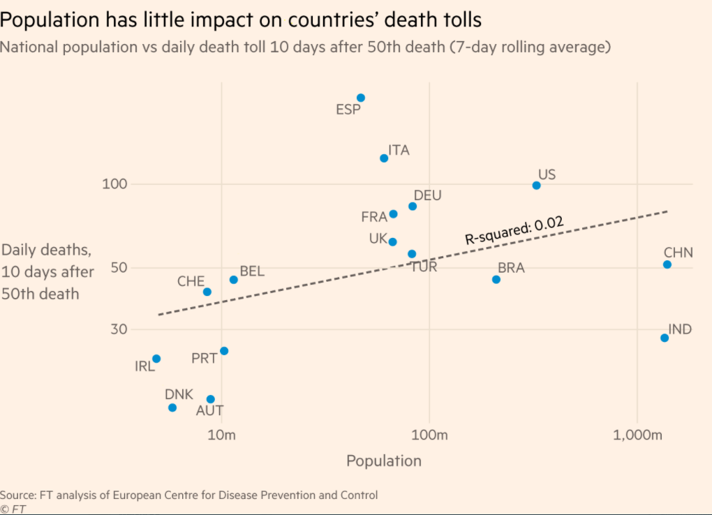
Population graphed against daily death toll with no clear correlation.
My personal recommendations for statistical graphs are from the FT’s John Burn-Murdoch, who regularly uploads graphs on his twitter account. His tweets include detailed explanations for what choices the FT made in graphing this way. However, there are a number of useful videos which show alternative ways to graph and estimate the extent of the pandemic, such as Khan Academy, 3Blue1Brown, and Minute Physics.
What Do The Numbers Mean?
It is unfortunate that not everyone seems to understand the limits of the numbers we have in front of us. There are a number of very easy conclusions to draw: the rate of infections is far higher than we know, the percentage of asymptomatic COVID-19 infections is likely far higher than we will be able to prove, and most countries will see improvements as their governments put structural measures in place aimed at curtailing the virus. Our numbers may be imperfect, but there is a clear correlation between countries which acted fast and countries which didn’t.
There are a number of other conclusions which have been drawn from a variety of sources using these statistics. I cannot tell you for certain which are true and which are false. I can only tell you to try and seek out reliable sources. This means respected scientific journals, professional virologists, and health organisations. But I do urge you to err on the side of caution, for two unfortunate reasons.
1. Scientific research is influenced by popular trends. Luckily for research scientists (and unluckily for the rest of us), the popularity of COVID-19 based research means that scientific journals are more lenient when accepting research in this area. For this reason, highly publicised research on COVID-19 can be variable.
2. A well-established and reliable source is not always your government. While most governments follow the advice of scientists and medical professionals, those who are in the most powerful political positions are not themselves experienced. I don’t want to sound like I’m writing this in a basement with a tinfoil hat, but I am also not going to recommend you to put complete trust in your government institution if it is giving you extremely suspect medical advice.
With this in mind, my advice is this: please, please, please err on the side of caution. It might seem like we are groping in the dark here, but hope is not lost. What the statistics are conclusive about is this: the more seriously a society takes their social distancing measures, the more likely the number of infected and number of deaths will decrease.
Image Sources
https://www.nytimes.com/2020/03/20/health/coronavirus-data-logarithm-chart.html
https://www.forbes.com/sites/trevornace/2020/03/22/population-adjusted-coronavirus-cases-top-10-countries-compared/#6dfb258d974f
https://twitter.com/jburnmurdoch/status/1249821596199596034/photo/1